XP Climate Control
Everything a Buyer Needed Was Already on the Site. Almost None of It Was Findable.
XP Climate Control designs and manufactures explosion proof climate control systems for hazardous environments — refineries, chemical plants, munitions storage, launch facilities. The expertise, the product range and the customer list were all real, and all already on the website. They were just spread through five paragraphs of introduction, a bulleted text list and a slideshow at the bottom of the page. We rebuilt the site around the order an engineer actually evaluates a supplier in.
The Problem
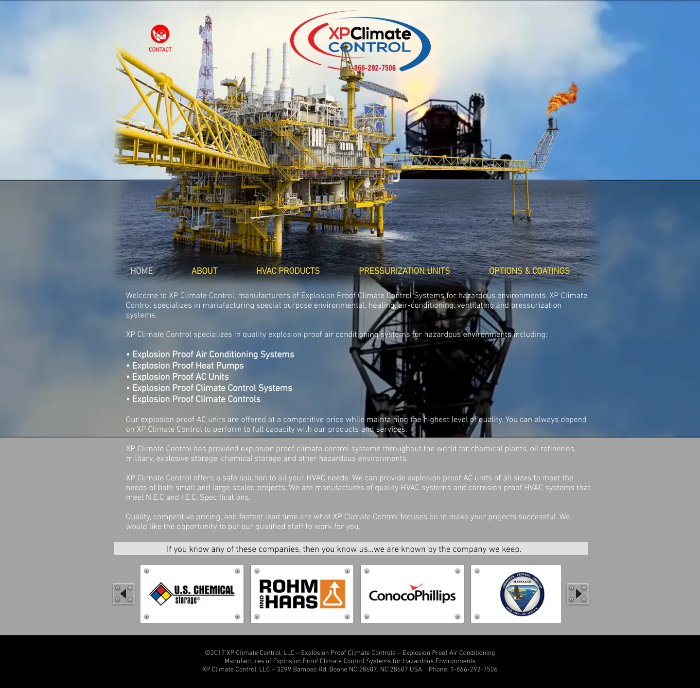
The homepage worked as an introduction rather than as a route to anything. Five paragraphs of company description ran down the page, and the navigation sat roughly three quarters of the way down the first screen, underneath a full-width photograph.
The products were a bulleted list of words. Explosion proof air conditioning, heat pumps, AC units and climate control systems were named in text, with no photographs, no links and nothing to indicate which one suited a given enclosure, load or footprint.
The single fact that qualifies this supplier for this buyer — that the systems are built to N.E.C. and I.E.C. specifications — appeared in the middle of a paragraph near the bottom of the page.
The industries served were listed inside a sentence. An engineer at a battery plant or a launch facility had nothing on the page to recognize as their own application.
The customer evidence was real and recognizable, and it was in an arrow-advance slideshow at the very bottom, below every paragraph of body copy.
There was no call to action anywhere on the homepage. The only route to a conversation was a small envelope icon in the top left corner.
What We Built
What Changed
- A visitor can tell what the company makes, who it makes it for and whether it meets their specification without scrolling.
- Products became somewhere to go instead of something to read. Each family carries a photograph, a one-line description of where it fits and a link.
- An engineer at an EV battery plant, a refinery or a defense facility now sees their own application named on the page.
- The recognizable customer names sit near the top, where they support the decision rather than confirming it afterwards.
- Someone ready to talk has three obvious ways to start, including one aimed specifically at a technical conversation.
What This Could Do in Your Business
Where this project stands. The rebuild below is a completed design and structure draft, not yet a deployed replacement for the live site. So this is a before-and-after of the buying experience — what a visitor sees, in what order, and what they can do next. We are not claiming traffic, ranking, conversion or revenue figures, because the new structure has not been in production long enough for anyone to have honestly measured them.
See the Difference
Both screenshots below are real captures of the two homepages, taken at the same viewport widths on the same day. Nothing has been cropped or rearranged to flatter the comparison.
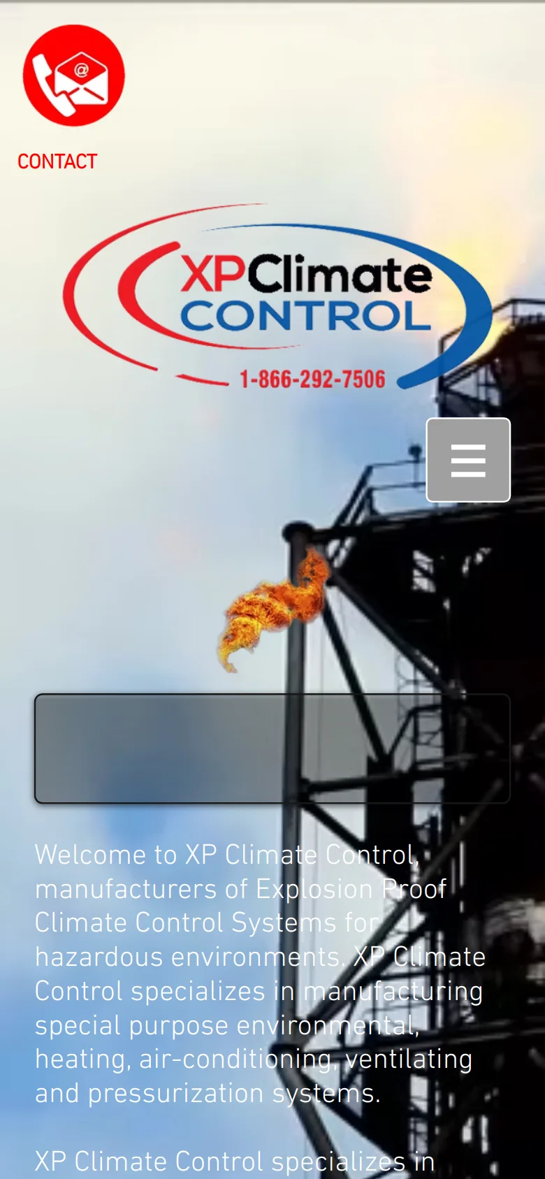
The original homepage. The company description, the product list and the credibility are all present — they are simply arranged as one continuous read, with the navigation below the fold of the photograph and no next step offered.
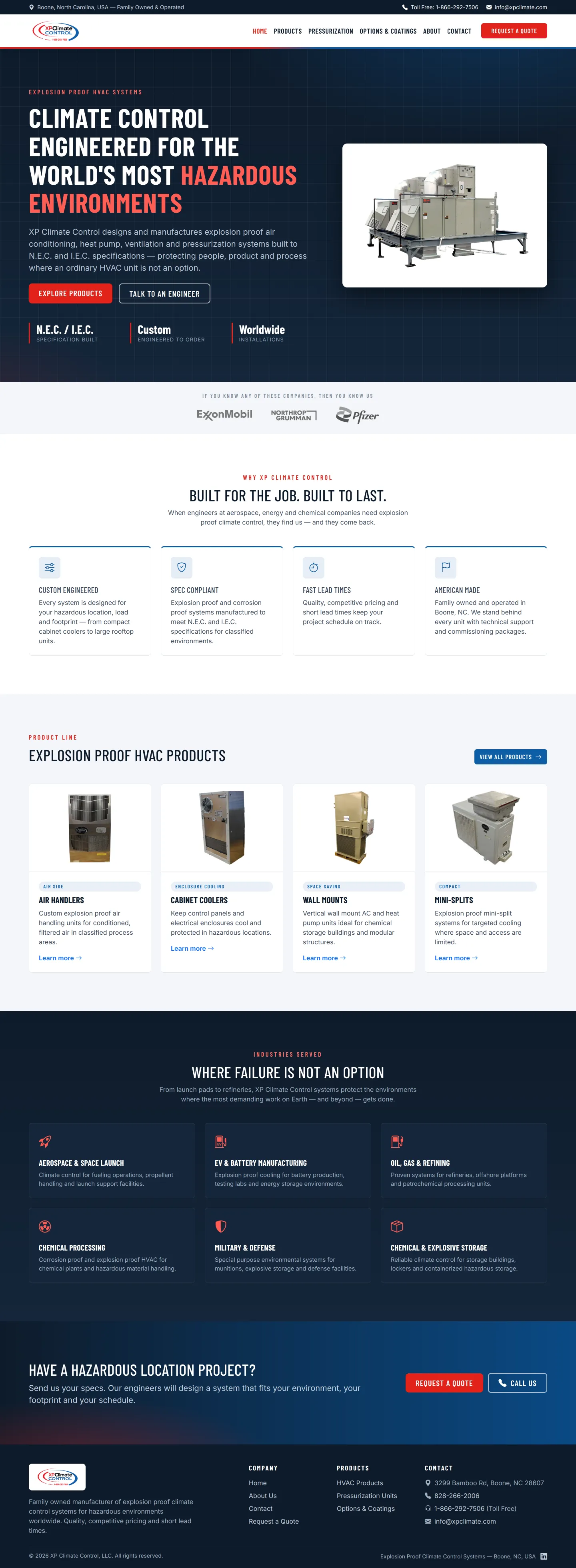
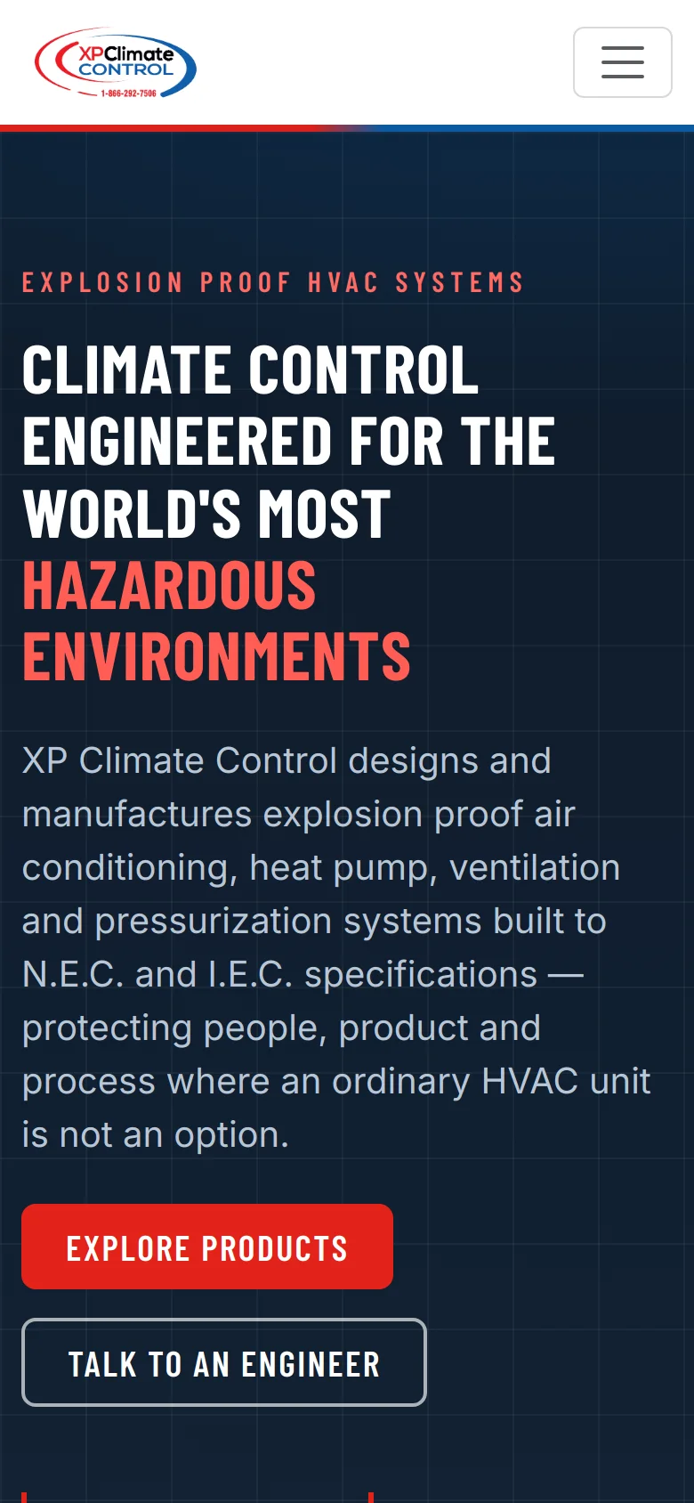
The rebuild. The same business, the same products and the same customers, ordered the way an engineer evaluates a supplier: what it is, whether it meets spec, what you make, who you make it for, and how to start a conversation.
Captured 23 August 2026 from xpclimate.com and xpclimatecontrol.designbyklein.com at 1440px and 390px, with pages fully loaded. Click any screenshot to open the full-length version.
What Changed, and Why
Every row below is a difference visible in the two screenshots above| What a buyer needs | Before | After |
|---|---|---|
| To know what you make | BeforeOpens with "Welcome to XP Climate Control, manufacturers of..." and five paragraphs of company description. | AfterA headline naming the product category and the environment it is built for, above the fold. |
| To find the right product | BeforeA bulleted list of five product names in body text. No images, no links. | AfterFour product families — air handlers, cabinet coolers, wall mounts, mini-splits — each with a photograph, a line on where it fits and a link. |
| To confirm it meets spec | BeforeN.E.C. and I.E.C. compliance stated mid-paragraph, near the bottom of the page. | AfterStated in the first screen, and again as one of four reasons to choose the company. |
| To recognize their own application | BeforeIndustries named inside a sentence: chemical plants, oil refineries, military, explosive storage. | AfterSix application areas as separate cards, including aerospace and battery manufacturing. |
| To trust the supplier | BeforeCustomer logos in an arrow-advance slideshow at the very bottom of the page. | AfterThe same kind of evidence placed directly under the hero, where it supports the decision. |
| To take a next step | BeforeNo call-to-action button on the page. A small envelope icon in the top corner. | AfterExplore Products, Talk to an Engineer, Request a Quote, and a phone number in a persistent header. |
| To navigate at all | BeforeMenu positioned low on the first screen, over the hero photograph. | AfterA fixed header carrying navigation, phone, email and a quote button on every page. |
The Part That Wasn't Design
What had to be decided before anything was drawnWho is actually reading this
The buyer here is usually an engineer or a specifier with a classified-area problem and a drawing. They are not browsing. They are checking whether you can supply something that will pass, and they will leave for a competitor who answers faster. That single fact set the order of the whole page.
Turning a range into a structure
"Explosion proof AC units of all sizes" is accurate but unnavigable. Grouping the range into four families gave a visitor a way in that does not require them to already know the catalog, and gave the site somewhere for each product to live.
Surfacing evidence that already existed
Nothing about the customer credibility was invented. Recognizable names were already on the original site — including ExxonMobil, Northrop Grumman and Pfizer. The change was moving that evidence from the bottom of the page to just beneath the hero.
Two different next steps
"Request a Quote" and "Talk to an Engineer" are not the same offer. One suits a buyer with a specification in hand; the other suits a buyer still working out what they need. Splitting them means neither has to pretend to be the other.
Why This Happens to Good Businesses
The pattern behind this project, not the project itselfXP Climate Control did not need a different business. It needed the website to communicate the business it had already become.
Almost every site like this was correct on the day it was written. Then the company added products, won larger customers, moved into new industries — and the site kept describing the company that existed at launch. Nothing looks broken, which is exactly why it goes unaddressed for years.
The symptoms are consistent. You may recognize some of them:
- Customers phone to ask questions the site already answers, somewhere.
- Your product range makes sense to everyone inside the company and to nobody outside it.
- You have won work with names that would impress a stranger, and the site mentions them last.
- The site is arranged the way the company is arranged, rather than the way a customer decides.
- The best explanation of what you do happens on a phone call, and never made it onto a page.
When that is the situation, the problem is rarely missing content. It is usually the order the existing content is in — and that is a structure problem, not a writing one.
The Practice Behind This Project
This was an information architecture and buyer-journey project rather than a styling exercise. It comes out of the same practice as the systems we build: work out how the business actually operates and how its customers actually decide, then build around that.
Has your business outgrown its website?
If customers keep calling to ask about information that is already on your site, the problem may not be missing content — it may be the order it is in. Show us the site you have and tell us who has to understand it.